들어가며
토이프로젝트로 필기노트 앱을 만들다가 여러 레퍼런스를 찾았다.
그 중 다크모드를 구현한 토이프로젝트를 봤는데 styled components 라이브러리를 이용한 구현이 흥미로웠다.
평소였으면 useState로 클래스 명을 바꾸면서 css로만 구현했을텐데 styled-components에 대한 장점이 많다고 하여 한번 구현해보고자 한다.
useState/css/삼항연산자를 이용한 다크모드
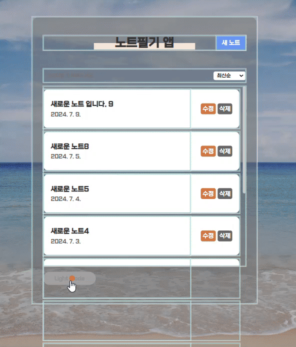
먼저 평소에 사용하던 css를 이용하여 배경을 바꿔봤다.
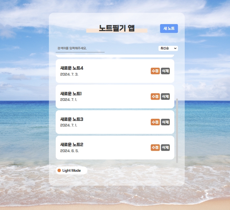
아래에 다크모드 토글버튼을 만들었다.
그리고 useState를 이용해서 ture면 다크모드, false면 라이트모드로 설정했다.
//App.js

(...)
const [darkMode, setDarkMode] = useState(false);
 (...)
function onDarkMode(){ //다크모드 토글 기능
    setDarkMode(!darkMode)
  }
      <div className={!darkMode ? "App" : "App dark"}  >
  (...)
<button onClick={onDarkMode} className={!darkMode ? 'theme_btn' : 'theme_btn dark'}>{!darkMode ? "Light Mode" : "Dark Mode"}</button>
</div>


//App.css
//라이트모드
 .App { padding:70px 0 50px 0; height:100%; transition:0.5s; }
 .App .theme_btn{background:#fff; padding:5px; border-radius: 50px; width:140px; height:35px; font-size: 14px; position:relative; transition:0.5s; margin-top:15px; }
 .App .theme_btn::after{content: ''; display: block; background:#f3772a; width:15px; height:15px; border-radius: 50%; position:absolute; top:calc(50% - 7.5px); left:8px; transition:0.5s;}
 //다크모드
 .App.dark{background:rgba(0,0,0,0.5);}
 .App .theme_btn.dark{background:#555; color:#fff;}
 .App .theme_btn.dark::after{  background:#f3772a; left:calc(100% - 23px);   }
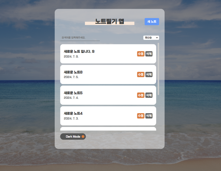
darkMode가 true면 class에 "dark"가 추가되고 텍스트 또한 "Dark Mode"로 변경된다.
또 class에 dark가 추가된 css를 추가한다.
마찬가지로 기본으로 적용되어있는 div.App 태그에도 추가하여 배경이 딤처리되도록 했다.
이런식으로 css/삼항연산자만 사용해서 구현하는 방법이 있다.
Styled-Components 사용법
라이브러리 설치
npm i styled-components라이브러리 사용
import styled from "styled-components" // 라이브러리 불러오기

const StyledButton = styled.button` //styled 함수는 속성으로 대부분 html 요소 이름을 그대로 갖고 있다.
    padding: 6px 12px;
`

export default function Button({children}){

    return(
        <StyledButton> //함수 이름으로 교체해준다.
            {children}
        </StyledButton>
    )
}
💡 html 속성을 사용하다보니 헷갈릴 수 있어 styled components의 이름은 파스칼 케이스(PascalCase)로 지정한다.
그외에는 노션에 정리했다.
https://hyjanghy.notion.site/Styled-Components-ef1718f940874efa971ae3b70c6c8dd8?pvs=4
Styled Components | Notion
라이브러리 설치 npm i styled-components
hyjanghy.notion.site
이번엔 노트 박스에 가변 스타일링을 통해 다크모드를 적용했다.
import styled from "styled-components";
(...)
const AppBg = styled.div`
 transition:0.5s;
  background:${(p)=> p.even === 'false'   ? "rgba(255,255,255, 0.5)" : "rgba(0,0,0,0.5)"  }
`

function App() {
 const [darkMode, setDarkMode] = useState(false);
 (...)
   return (
    <div className={!darkMode ? "App" : "App dark"}  >
          <AppBg className='app_wrap' even={`${darkMode}`}>
           (...)
            <button onClick={onDarkMode} className={!darkMode ? 'theme_btn' : 'theme_btn dark'}>{!darkMode ? "Light Mode" : "Dark Mode"}</button>
         </AppBg>
      </div>

  );
이렇게 적용하면 작동은 되지만 콘솔창에 무언가 경고창이 뜬다.
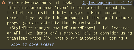
StyledComponent.ts:142 styled-components: it looks like an unknown prop "even" is being sent through to the DOM, which will likely trigger a React console error. If you would like automatic filtering of unknown props, you can opt-into that behavior via `<StyleSheetManager shouldForwardProp={...}>` (connect an API like `@emotion/is-prop-valid`) or consider using transient props (`$` prefix for automatic filtering.)
대충 내가 props로 전달한 even이 DOM으로 받아들여진다. 즉 내가 추가한 className처럼 속성값처럼 보일 수 있다는 이야기였다.
그럴땐 변수명 앞에 $를 붙여주자.
const AppBg = styled.div`
 transition:0.5s;
  background:${(p)=> p.$even === 'false'   ? "rgba(255,255,255, 0.5)" : "rgba(0,0,0,0.5)"  }
`
(...)
<AppBg className='app_wrap' $even={`${darkMode}`}>
(...)
</AppBg>
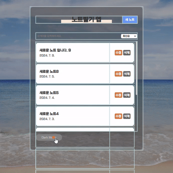
이렇게 적용하면 경고창이 없어진다.
그리고 props 값은 문자열로 보내야한다고 또 경고창이 있었어서 템플릿 리터럴 타입(``)으로 적용했다.
사실 이런식으로 적용하면 컴포넌트의 태그마다 색을 하나하나 입히는거라 유지보수 측면에선 좋지 않다.
그래서 theme.js에 다크모드, 라이트모드의 서로 대비되는 색들을 모아서 필요한 부분에만 적용해준다.
이때 자식 컴포넌트에 theme를 보내줄 ThemeProvider와 useContext 라이브러리를 사용하면 props가 드롤링 되는 부분 없이 적용할 수 있다.
//theme.js

export const lightTheme = {
    colors:{
        defaultBg:"#fff",
        defaultFont:"#333",
        listBox:"#fff",
        headerH1:"linear-gradient(to top, #ffe6d7 50%, transparent 50%)",
        h1Weight:"900"
    }
}

export const darkTheme = {
    colors:{
        defaultBg:"#333",
        defaultFont:"#fff",
        listBox:"#555",
        headerH1:"linear-gradient(to top, #2e9aff 50%, transparent 50%)",
        h1Weight:"100"
    }
}
이렇게 분류한 색을 컬러칩이라고 불러보자
import styled,{ThemeProvider} from "styled-components"; //ThemeProvider 불러오기
import { darkTheme, lightTheme } from './components/theme'; //컬러칩 불러오기

export  const ThemeContext = React.createContext(); //context는 컴포넌트 밖에서 불러와야한다.

function App() {
 const [darkMode, setDarkMode] = useState(false);
 const [themeMode, setThemeMode] = useState('lightTheme');

 const theme = themeMode === 'lightTheme' ? lightTheme : darkTheme ; // theme에 전달할 컬러칩 삼항연산자

  function onDarkMode(){ //다크모드 버튼 토글 기능
    setDarkMode(!darkMode);
    if(!darkMode){
      setThemeMode('darkTheme');
    }else{
      setThemeMode('lightTheme');
    }
  }

  return (
    <ThemeContext.Provider value={theme}>
      <ThemeProvider theme={theme}> // ThemeProvider에는 theme를 props로 보내줘야한다.
      (...)
      	<button onClick={onDarkMode} className={!darkMode ? 'theme_btn' : 'theme_btn dark'}>{!darkMode ? "Light Mode" : "Dark Mode"}</button>
       </ThemeProvider>
    </ThemeContext.Provider>
특히 styled 속성은 컴포넌트 여기저기에서 사용하기 때문에 useContext를 사용하여 props를 전달하지 않으면 드롤링이 심하게 나타난다.
예를들면 Header 컴포넌트가 Home, Edit, View 컴포넌트에 들어있다면 세개의 컴포넌트에도 props를 보내고 그 안에있는 Header 컴포넌트에도 각각 보내야한다. (벌써 6개🫠)
여기서 자잘한 오류들이 많았는데 첫번째로 React.createContext를 export로 바로 내보내지 않아서 자식 컴포넌트가 받지 못하는 오류가 있었다.
또 ThemeProvider에는 theme 속성을 꼭 넣어줘야한다는 것이다.
그래서 따로 theme 변수에 삼항연산자로 컬러칩을 전달해줬다.
그럼 먼저 Header 컴포넌트에만 적용해보자.
import styled  from 'styled-components'
import './Header.css'
import { useContext } from 'react' //useContext 불러오기
import { ThemeContext } from '../App' //export로 내보냈던 ThemeContext 불러오기

const StyledHeader = styled.header`
    color:${(p)=>p.theme.colors.defaultFont};
    h1{ //자식 태그만 적용
        background:${(p)=>p.theme.colors.headerH1};
        font-weight:${(p)=>p.theme.colors.h1Weight}
    }
`

export default function Header({title, leftChild, rightChild }){
    const theme = useContext(ThemeContext); //theme 변수에 저장

    return(
        <StyledHeader id="header" theme={theme}> //styled 태그로 교체 및 theme 컬러칩 전달

            <div className='leftChild'>{leftChild}</div>
            <h1>{title}</h1>
            <div className='rightChild'>{rightChild}</div>
        </StyledHeader>
    )
}
const StyledHeader = styled.header`` 안에 h1같은 태그를 넣으면 header의 자식 태그인 h1에만 스타일이 적용된다.
그 기능을 이용하여 헤더의 타이틀 스타일까지 토글될 수 있도록 했다.
다른곳으로 prop을 보내지 않고 useContext를 이용하면 Header 컴포넌트에만 적용해도 모든 Header 컴포넌트에 props 값을 적용할 수 있다.
'Study > React' 카테고리의 다른 글
| [React] css 말줄임 처리 & 리액트 툴팁 스타일링하기 (React Tooltip) (0) | 2024.07.16 |
|---|---|
| [React] styled-components로 다크모드 만들기 (placeholder, after, before...) (0) | 2024.07.12 |
| [ReactJS/AXIOS] 백엔드 없이 로그인 구현하기 (4) (0) | 2024.07.04 |
| [ReactJS/AXIOS] 백엔드 없이 로그인 구현하기 (3) (+댓글 작성, LocalStorage 암호화) (0) | 2024.07.03 |
| [ReactJS/AXIOS] 백엔드 없이 로그인 구현하기 (2)_DELETE (0) | 2024.07.01 |