들어가며
이전에 styled-components를 이용하여 다크모드를 적용할 수 있는 노트앱을 만들었다.
지인에게 피드백을 부탁했는데 제목이 길어지면 말줄임 처리되고 툴팁으로 볼 수 있도록 해보라는 추천을 받았다.
툴팁을 이용해 꾸미는것은 처음이라 적용해보며 배워보도록 하겠다.
css를 이용한 말줄임 처리
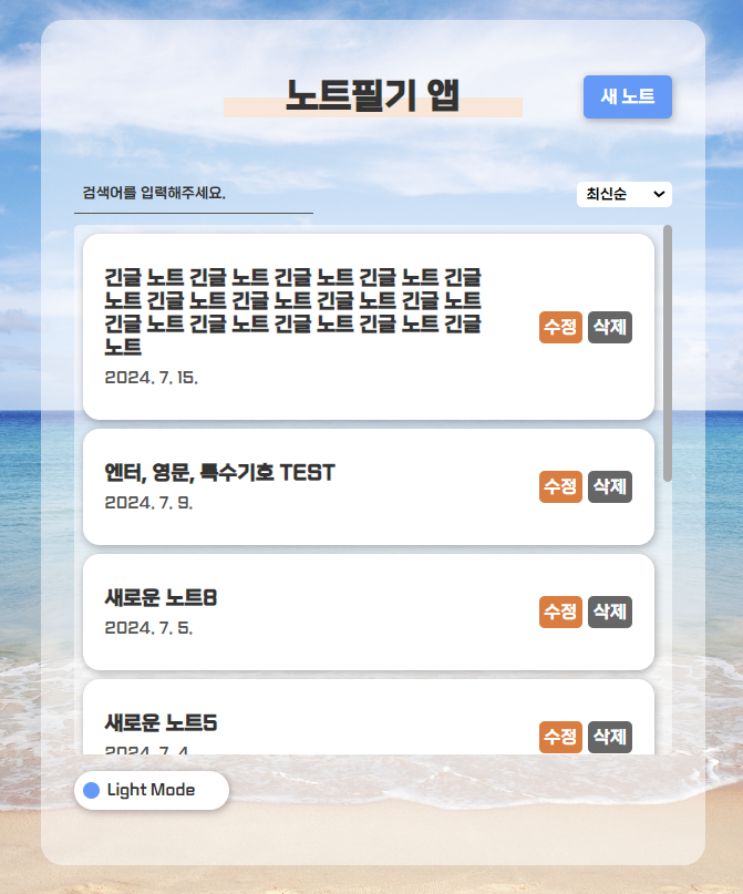
아직 제목의 input이나 css에 아무 조치를 하지 않아서 무한하게 제목을 쓸 수 있다.
input에서 maxLength를 이용하면 글자수 제한을 둘 수 있지만 반응형으로 진행하다보면 결국 두 줄, 세 줄로 늘어나게 될 것이다.
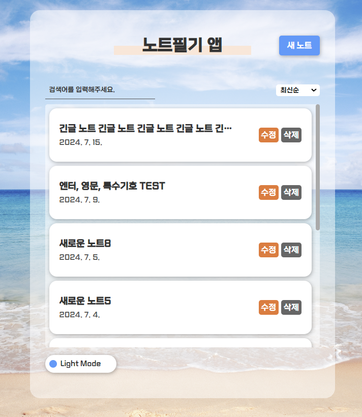
css에서는 box 속성을 이용하여 말줄임 처리를 할 수 있다.
display:-webkit-box; //box로 지정
-webkit-line-clamp : 1 //1줄까지 보이게하기
-webkit-box-orient:vertical // 박스의 흐름방향(수직)
여기에 overflow:hidden까지 해주면 1줄 아래로는 안보이게 할 수 있다.

💡 display:box 속성은 모바일 반응형으로도 적용할 수 있다.
title 속성으로 풀버전 확인하기
만약 Home에서 요약된 제목의 풀버전을 보고싶다면 어떻게 해야할까?
나는 마우스를 호버했을 때 말풍선으로 보이게 하려고 한다.
    <Link to={`/view/${it.id}`}  title={it.title} //title 추가  className='note_title'>
        <h1>{it.title}</h1>
        <p>{it.day}</p>
    </Link>
title 속성을 추가하면 마우스를 호버했을 때 속성값이 말풍선으로 보인다.
기본 디자인은 검은 바탕에 흰글씨인데 이것을 react-tooltip을 이용하여 꾸며보려고 한다.
react- tooltip으로 말풍선 꾸미기
먼저 node 라이브러리에서 리액트 툴팁을 설치한다.
npm i react-tooltip
내가 설치한 버전은 5.27.1인데 만약 v5.13.0보다 낮은버전이라면 src/index.js에 css파일을 수동으로 가져와야 한다.
css파일은 한번만 가져오면 된다.
import 'react-tooltip/dist/react-tooltip.css'
React Tooltip 사용방법
//단일 지정
import { Tooltip } from 'react-tooltip'

<a
    data-tooltip-id="my-tooltip" //<Tooltip/> 요소와 연결할 ID
    data-tooltip-content="Hello world!" //말풍선에 들어갈 콘텐츠
    data-tooltip-place="top" // 말풍선 위치
>
안녕
</a>

<Tooltip id="my-tooltip"/>

----
//복수 지정
import { Tooltip } from 'react-tooltip'

<a className="my-anchor-element">◕‿‿◕</a>
<a className="my-anchor-element">◕‿‿◕</a>
<a className="my-anchor-element">◕‿‿◕</a>

<Tooltip anchorSelect=".my-anchor-element" place="top">
//anchorSelect에는 유효한 CSS 선택자를 넣어야함
  Hello world!
</Tooltip>

----
//말풍선 클릭 (clickable)
<a id="not-clickable">◕‿‿◕</a>
<Tooltip anchorSelect="#not-clickable">
  <button>You can't click me :(</button>
</Tooltip>

<a id="clickable">◕‿‿◕</a>
<Tooltip anchorSelect="#clickable" clickable>
  <button>You can click me!</button>
</Tooltip>
💡<Tootip/> 요소 안에 ID를 설정하지 않으면 작동하지 않는다.
더 많은 속성을 보려면 아래 사이트를 확인하면 된다.
https://react-tooltip.com/docs/options#available-attributes
Options | React Tooltip
All available data attributes for the anchor element and props for the tooltip component.
react-tooltip.com
노트앱에도 한번 적용해보자
            <Link to={`/view/${it.id}`}
            	data-tooltip-id='my-tooltip' //Tooltip 연결 id
            	data-tooltip-content={it.title} // 말풍선 속 콘텐츠
            	data-tooltip-place='bottom' // 말풍선 위치
            	className='note_title'
            >
                <h1>{it.title}</h1>
                <p>{it.day}</p>
            </Link>
            <Tooltip id='my-tooltip' />
기존 title 속성에 넣었던 값을 data-tooltip-content에 적용했다.
data-tooltip-place="bottom"으로 기본 위치는 bottom 이지만
박스를 넘어가거나 잘리면 빈곳으로 저절로 배치되는 것 같다.
React Tooltip 스타일링
리액트 툴팁을 스타일링 하는 방법은 여러가지가 있다.
인라인 스타일링
 <Tooltip
  id="my-tooltip-inline"
  style={{ backgroundColor: "rgb(0, 255, 30)", color: "#222" }}
/>
Class 정의
<style>
.example {
  color: #222;
  background-color: rgb(0, 247, 255);
}
</style>

<div className="example-container">
  <a
    data-tooltip-id="my-tooltip-styles"
    data-tooltip-content="Hello world!"
  >
    ◕‿‿◕
  </a>
  <Tooltip id="my-tooltip-styles" className="example" />
</div>
💡Tootip에 클래스를 지정하면 !important 없이도 추가로 스타일을 지정할 수 있다고 한다.
Tooltip 기본 스타일
tooltip에서 제공하는 기본 스타일은 아래와 같다.
.tooltip {
  padding: 8px 16px;
  border-radius: 3px;
  font-size: 90%;
  width: max-content;
}

.arrow {
  width: 8px;
  height: 8px;
}

[class*='react-tooltip__place-top'] > .arrow {
  transform: rotate(45deg);
}

[class*='react-tooltip__place-right'] > .arrow {
  transform: rotate(135deg);
}

[class*='react-tooltip__place-bottom'] > .arrow {
  transform: rotate(225deg);
}

[class*='react-tooltip__place-left'] > .arrow {
  transform: rotate(315deg);
}

/** Types variant **/
.dark {
  background: var(--rt-color-dark);
  color: var(--rt-color-white);
}

.light {
  background-color: var(--rt-color-white);
  color: var(--rt-color-dark);
}

.success {
  background-color: var(--rt-color-success);
  color: var(--rt-color-white);
}

.warning {
  background-color: var(--rt-color-warning);
  color: var(--rt-color-white);
}

.error {
  background-color: var(--rt-color-error);
  color: var(--rt-color-white);
}

.info {
  background-color: var(--rt-color-info);
  color: var(--rt-color-white);
}
Tooltip 핵심 스타일
.tooltip {
  position: absolute;
  top: 0;
  left: 0;
  pointer-events: none;
  opacity: 0;
  will-change: opacity;
}

.fixed {
  position: fixed;
}

.arrow {
  position: absolute;
  background: inherit;
}

.noArrow {
  display: none;
}

.clickable {
  pointer-events: auto;
}

.show {
  opacity: var(--rt-opacity);
  transition: opacity var(--rt-transition-show-delay) ease-out;
}

.closing {
  opacity: 0;
  transition: opacity var(--rt-transition-closing-delay) ease-in;
}

/** end - core styles **/
Tooltip 클래스 작동 방법
.example {
  color: #222;
  background-color: rgb(0, 247, 255);
}

/** Add next line only if you want to have a tooltip arrow with a different background color from the tooltip **/
.example .example-arrow {
  background-color: rgb(255, 0, 0);
}
위와 같이 적용하면 기존의 .dark 와 동일한 수준의 클래스를 갖기 때문에 또 다른 수준의 선택자를 추가해야 한다.
.some-class-or-rule .example {
  color: #222;
  background-color: rgb(0, 247, 255);
}

/** Add next line only if you want to have a tooltip arrow with a different background color from the tooltip **/
.some-class-or-rule .example .example-arrow {
  background-color: rgb(255, 0, 0);
}
이외에 화살표 색, 불투명도 등의 다양한 스타일링은 아래의 페이지에서 확인이 가능하다.
https://react-tooltip.com/docs/examples/styling
Styling | React Tooltip
How to customize tooltip styles in ReactTooltip styles.
react-tooltip.com
나만의 툴팁 만들기
 //NoteItem.css
#my-tooltip{color:#f6f6f6; background:rgb(80 110 141)}
.noteitem_wrap .tooltip-arrow{background:lightcoral}

//NoteItem.js
<Link to={`/view/${it.id}`}
    data-tooltip-id='my-tooltip'
    data-tooltip-content={it.title}
    data-tooltip-place='bottom'
    className='note_title'
 >
    <h1>{it.title}</h1>
    <p>{it.day}</p>
 </Link>
 <Tooltip id='my-tooltip' classNameArrow='tooltip-arrow' />
💡classNameArrow로 클래스명을 지정하면 화살표 스타일을 바꿀 수 있다.
기존 스타일은 .dark가 지정되어 있기 때문에 .dark보다 높은 수준의 선택자를 선택해야 한다.

'Study > React' 카테고리의 다른 글
| [React] 날짜 정렬 + 아이폰(IOS) 오류 (axios, sort) (3) | 2024.07.19 |
|---|---|
| [React] .env로 경로 숨기기 (배포, 개발) (1) | 2024.07.18 |
| [React] styled-components로 다크모드 만들기 (placeholder, after, before...) (0) | 2024.07.12 |
| [React] styled-components로 다크모드 만들기(ThemeProvider/useContext) (0) | 2024.07.10 |
| [ReactJS/AXIOS] 백엔드 없이 로그인 구현하기 (4) (0) | 2024.07.04 |